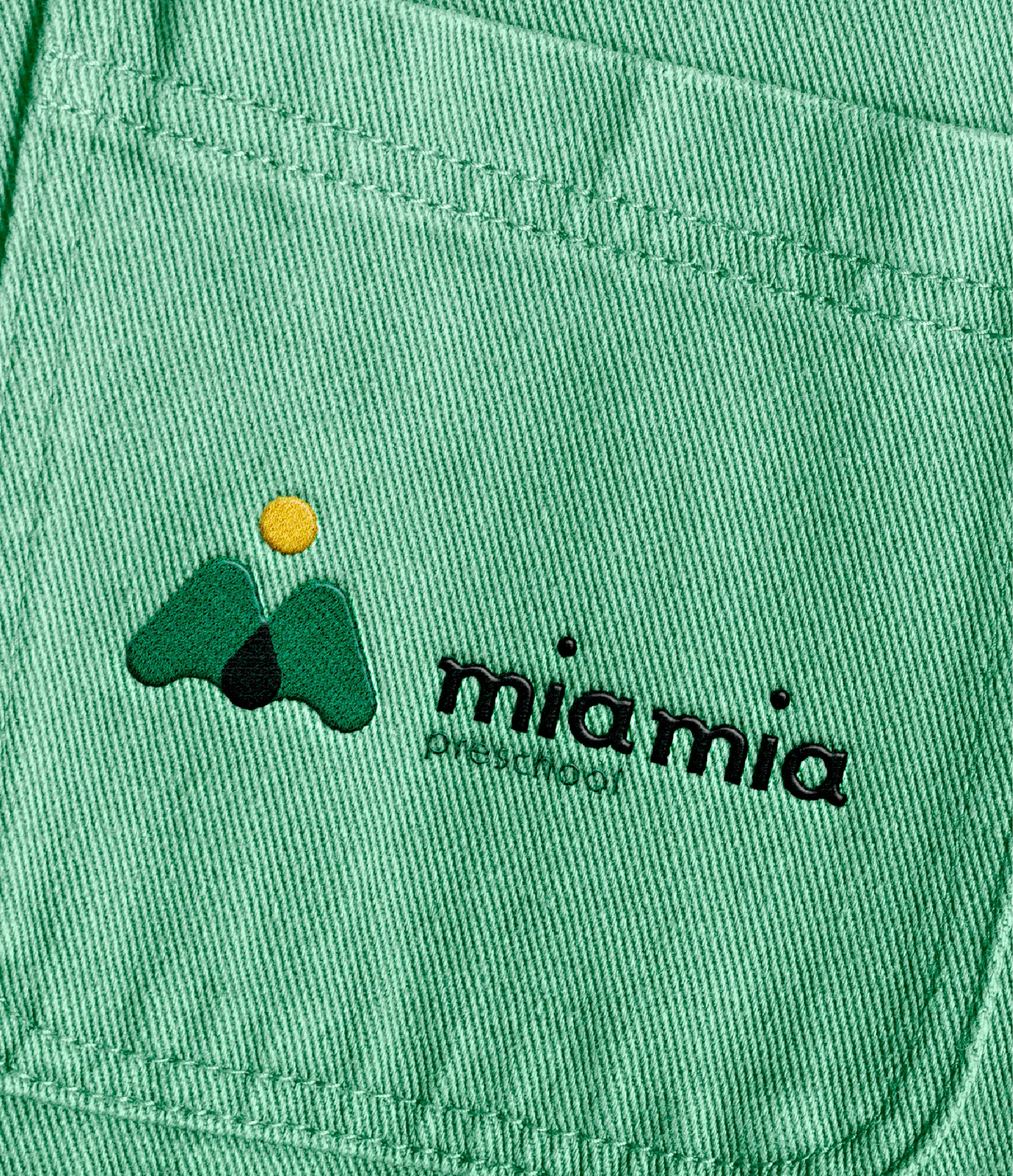
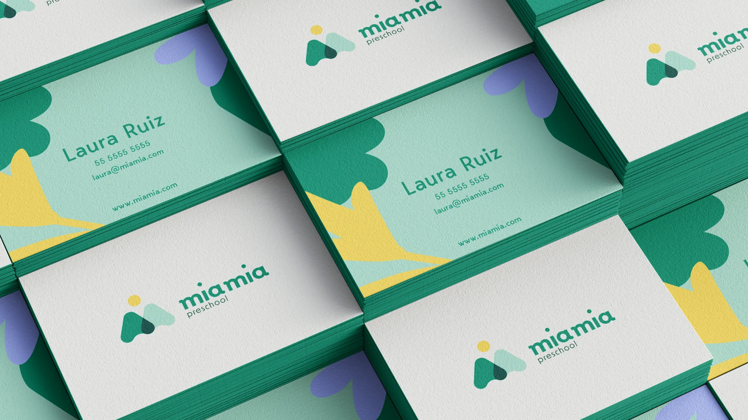
As we created the primary logotype, we discovered that the the true essence of Mia Mia’s identity lived in the isotype. We found a way to incorporate nature, community and MIA’s letters into it, the outcome is exactly what we envisioned.
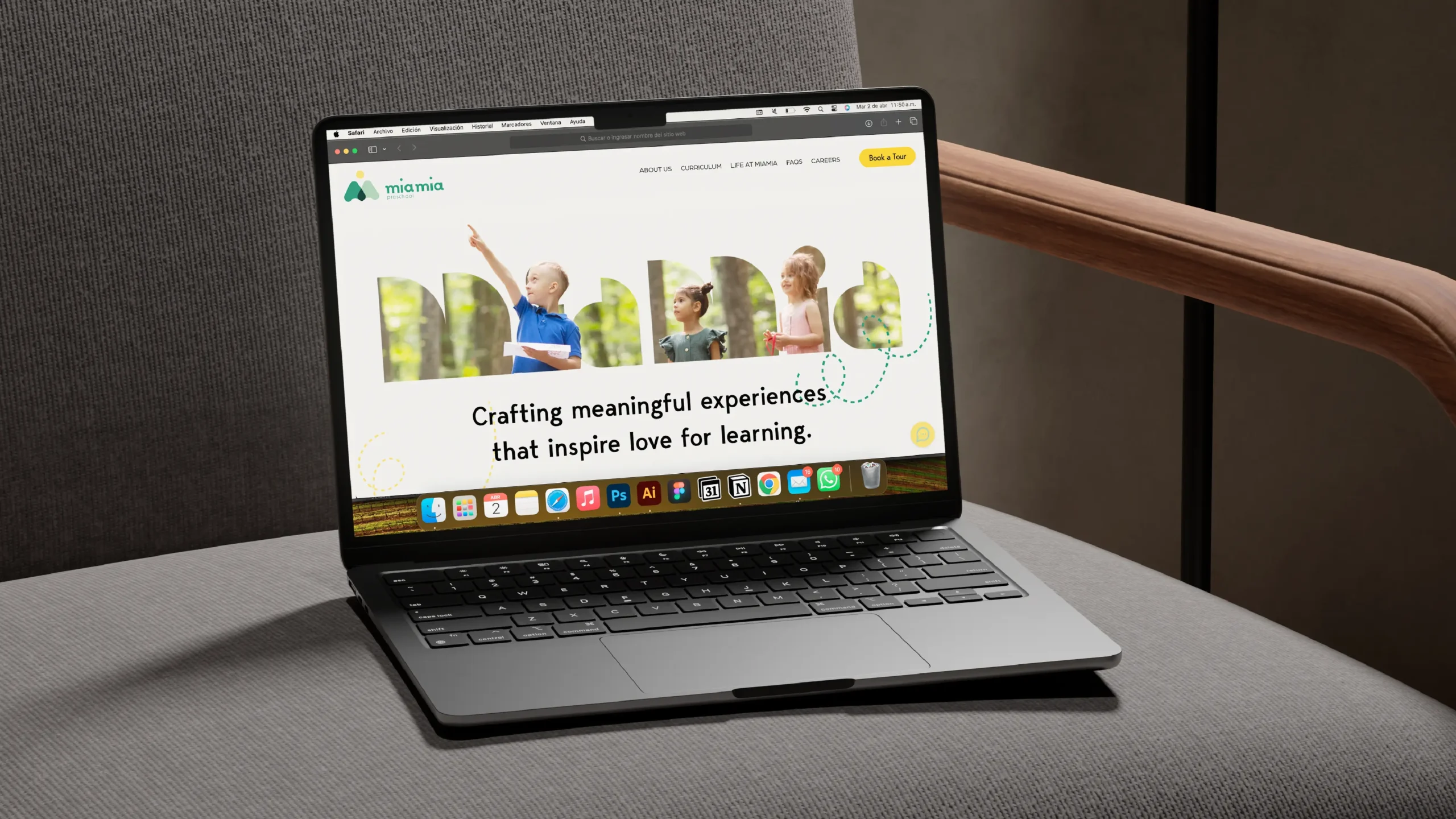
For the web page The solution for the project involved a modern design that aligned with the identity and branding of”Mia Mia Preschool”. The website incorporated interactive elements and ensured easy access to key information, providing an intuitive and efficient user experience on both desktop and mobile devices.